
Reusable Transparent CSS Rounded Corners
In retrospective, there are definitely some areas where I could have improved on my Karate Corners design. I decided to take a second look and write a quick post that details how I create corners today, after almost a year of evolution in the ever-changing world of web design. This is absolutely the most simple and efficient way to create rounded corners using strictly CSS and HTML.
Rounded corners are all the rage; they have been for some time now. There are pure CSS approaches to implementing this type of design, but occasionally your clients demand that your user experience be consistent across all browsers. Whether it’s time to stop using HTML and images for rounded corners is still a matter of debate. Nonetheless, I think every designer finds themselves doing this from time to time.
Say No to Images
I’ve found that many designs contain various types of rounded box styles on the same page. In my previous tutorial, this would demand that you create a separate corner image for each style of box. If you have a box with a red background, you’ll need to create a corner image with red corners. That makes sense from a visual perspective. From a data perspective, however, it’s not the best approach. If you think about it, the only thing you’re really “downloading” when you download a corner image is the curvature of your box’s edge. Wouldn’t it be better if we could somehow reuse that data on every box style everywhere else in your design?
Well, you can! How gloriously fantastic! Well…don’t get all excited just yet. There are a few limitations to this. This will only work when your rounded box appears on a solid color. For instance, the text you’re reading right now is on a solid white background. We can easily add rounded boxes to this page because of the solid color. This doesn’t really work if your background is an image or a gradient color.
Meet the Sprite
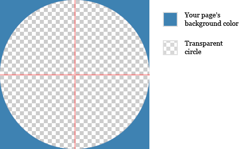
So, you have a solid background color, and you’re ready to add some rounded corner boxes to your page. The only really important thing here is your corners image. In Photoshop or an image editing software of your choice, create a square image. Basically, your image is all four box corners stuck together, so make it symmetrical. Fill your image with the background color of your page, and then delete a circle out of the middle of the square. It’s that easy! Here’s what it should look like when you’re done:
In case you’re not Photoshop-savvy, I have created a few templates that you can download and use.
- TransparentCorners-10.psd — 10×10 pixel corner image template
- TransparentCorners-15.psd — 15×15 pixel corner image template
- TransparentCorners-20.psd — 20×20 pixel corner image template
The Markup
Now that we have this nice fancy reusable transparent corner image, it’s time to create the HTML that will be used to house our beautiful box and its contents. Here’s the basic setup:
<div class="box red">
  <div class="corner TL"></div>
  <div class="corner TR"></div>
  <div class="corner BL"></div>
  <div class="corner BR"></div>
  <p>This is your box content. Lorem ipsum dolor sit amet.</p>
</div>
Pretty simple, right? We have an outer “box” <div/>, a <div/> for each corner, and then our content that will appear inside the box.
The Style
Our HTML doesn’t do much by itself. Most of the work to be done is going to be done in our CSS style sheet. In an attached style sheet, add the following CSS:
.box {
  position: relative;
  padding: 1em;
}

.red {
  background: #cc0000;
  color: #fff;
}

.corner {
  position: absolute;
  width: 10px;
  height: 10px;
  background: url(/path/to/cornerImage.png) no-repeat;
}

.TL {
  top: 0;
  left: 0;
  background-position: 0 0;
}

.TR {
  top: 0;
  right: 0;
  background-position: 100% 0;
}

.BL {
  bottom: 0;
  left: 0;
  background-position: 0 100%;
}

.BR {
  bottom: 0;
  right: 0;
  background-position: 100% 100%;
}
As you can see, we’re really trying to keep this simple. Basically, we have an outer “box” style, a “red” style that sets the box’s background color to red, and finally individual “corner” styles that will automatically position themselves at the edges of our content, regardless of the height/width of that content. Groovy.
The Result
I’ve created a simple “white” background corner image for use on this page. What you get when you put all of this together is a very flexible corner system that requires very little HTML and CSS to implement:
Lorem ipsum dolor sit amet, consectetur adipiscing elit. Quisque justo felis, molestie rutrum blandit vitae, pellentesque vitae risus. Nunc hendrerit eleifend lectus. Aenean interdum facilisis sem eget laoreet. Morbi in nisl nec neque auctor volutpat. Nam sodales felis id magna cursus ac pretium libero mollis.
And the coolest part…
It’s Reusable!
The coolest part about using transparent images for our corners is that we can apply these corners to just about anything on our page that we want to. For instance, I could create some additional box styles (other than “red”) by adding a bit of CSS.
.red {
  background: #cc0000;
  color: #fff;
}

.blue {
  background: #00cc00;
  color: #fff;
}

.green {
  background: #0000cc;
  color: #fff;
}

.gray {
  background: #dedede;
  color: #666;
}
After changing our box’s class (class="box blue", class="box green", etc.), we would get:
Suspendisse potenti. Morbi eget turpis urna. Fusce tincidunt sem mollis lacus euismod rhoncus sagittis est placerat.
Suspendisse potenti. Morbi eget turpis urna. Fusce tincidunt sem mollis lacus euismod rhoncus sagittis est placerat.
Suspendisse potenti. Morbi eget turpis urna. Fusce tincidunt sem mollis lacus euismod rhoncus sagittis est placerat.
Gray is the new “red”. Vestibulum iaculis varius laoreet. Ut et condimentum nunc. Suspendisse eleifend congue dolor, non consequat ante tristique sit amet.
That’s really cool, but this doesn’t even touch the limits of how you can apply this. In addition to solid color boxes, we could also apply this to photos and gradients (which would be much harder in a more traditional corner system). Our corners really don’t care what type of content they’re applied on, they only really care about the background color. Let’s try it out on some different page elements (accompanying HTML and CSS are included for each style):
The Mini Profile
HTML:
<div class="box photo">
  <div class="corner TL"></div>
  <div class="corner TR"></div>
  <div class="corner BL"></div>
  <div class="corner BR"></div>
  <h3>My Profile</h3>
  <img src="kyle.jpg" alt="Me" />
</div>
CSS:
.photo {
  width: 200px;
  padding: 0;
}

.photo h3 {
  background: #000;
  color: #fff;
  padding: 10px 20px;
  margin: 0;
  font-size: 1em;
}
My Profile

The Gradient
HTML:
<div class="box blueGradient">
  <div class="corner TL"></div>
  <div class="corner TR"></div>
  <div class="corner BL"></div>
  <div class="corner BR"></div>
  <p>Notice the gradient background image!</p>
</div>
CSS:
.blueGradient {
  background: url(gradient-image.png) repeat-x;
  color: #fff;
}
Notice the gradient background image! Lorem ipsum dolor sit amet, consectetur adipiscing elit. In facilisis posuere purus, vitae sagittis enim sodales at. Proin in purus et metus vestibulum cursus. Vivamus volutpat dolor quis lectus cursus et lobortis felis iaculis. Aenean ut enim magna, sit amet convallis mi. In hac habitasse platea dictumst. In hac habitasse platea dictumst.
We’ve accomplished all of the styles you see above using a single image and some fancy CSS footwork. This really minimizes the impact of your corners on page download times, especially if you’re using a number of different styles on a single background color. No scripts, no confusing HTML, simple markup, and a single image. Happy styling.