
Rounded Corners in Mozilla and Safari
The W3C’s CSS3 specification includes an oft-requested CSS attribute called border-radius. Using this attribute, you can create rounded-corner boxes that use no images, script, or other fancy DHTML tricks (pure CSS). This will make your site flexible, faster, and more accessible. It’s not yet supported in Internet Explorer 7/8, but other modern browsers have already introduced support for this fantastic CSS feature.
Both Mozilla Firefox and Apple’s Safari browsers have made it incredibly easy to eliminate those sharp corners with a single CSS attribute. Here’s the code:
.myRoundedBox {
-moz-border-radius: 10px;
-webkit-border-radius: 10px;
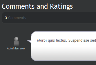
}You’ll notice that this CSS isn’t merely clipping the contents of the block element you’re applying it to. If your <div/> has a border associated with it, the border will adhere to the contours of your newly rounded corner. Throw in a slight background color or gradient, and you can create some really stunning effects. Here’s a quick look at something I was creating, just to play around with this great new feature:
Using border-radius instead of corner images can eliminate a lot of HTML and unneeded CSS, which saves on bandwidth and improves the performance of your site as a whole. Of course, the big monster of a caveat here is that your design won’t be consistent across browsers. That certainly isn’t good, but on the other hand, rounded corners don’t have any effect on the functionality of your site, so it will work just the same on any browser.
For more information about this upcoming CSS3 attribute, see the official W3C specification here. In addition, Mozilla’s proprietary support for this feature is documented here.