
Karate Corners: XHTML/CSS Rounded Corners
I’ve seen a lot of different ways to create round corners and boxes in web sites, and quite frankly I haven’t exactly fallen in love with any of them. A lot of the methods that I’ve seen use either (1) a table structure which I try to avoid at all costs, (2) too many nested <div> tags, (3) complex CSS, or (4) too many different images that have to be loaded all at once.
Update: Read my subsequent post for a more advanced example of this technique!
Update: Read a even more advanced version of this technique in an even newer tutorial!
Update: Find out how to automatically generate the HTML and CSS for this technique using jQuery.
I took the best of the best and came up with a very simple way to create totally scalable boxes with round corners. I’ve tested this on Internet Explorer 6, IE 7, Mozilla FireFox 2, Firefox 3, Opera 9, and Safari 3.
The Code
The HTML code is relatively simple. You have an outer <div> tag with four “corner” <div>s inside of it. Each of these corner <div>s are positioned with CSS so that they always appear at each corner of the outer <div> box.
HTML:
<div class="cornerBox">
  <div class="corner TL"></div>
  <div class="corner TR"></div>
  <div class="corner BL"></div>
  <div class="corner BR"></div>
  <div class="cornerBoxInner">
    <p>Lorem ipsum dolor sit amet.</p>
  </div>
</div>
CSS:
.cornerBox {
  position: relative;
  background: #cfcfcf;
  width: 100%;
}

.corner {
  position: absolute;
  width: 10px;
  height: 10px;
  background: url('corners.gif') no-repeat;
  font-size: 0%;
}

.cornerBoxInner {
  padding: 10px;
}

.TL {
  top: 0;
  left: 0;
  background-position: 0 0;
}

.TR {
  top: 0;
  right: 0;
  background-position: -10px 0;
}

.BL {
  bottom: 0;
  left: 0;
  background-position: 0 -10px;
}

.BR {
  bottom: 0;
  right: 0;
  background-position: -10px -10px;
}
The Image

Only one image is used for this box (shown above). In my example, I created a 20×20 circle, which is comprised of four 10×10 corners. By shifting the background image around, you can eliminate the need to download four separate GIF files on each of your boxes.
The Result
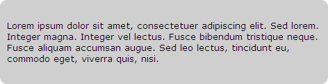
Karate Corners! Click on the image above to see the HTML demo. Happy styling!