
SP Blueprint
In my previous post, Minifying SharePoint 2013, I talked about the idea of minifying SharePoint’s CSS files in order to achieve better performance and better style cascading in CSS. Truly, this was the direct result of my work on a starter master page template I had been working on for SharePoint 2013, which is now available on CodePlex.
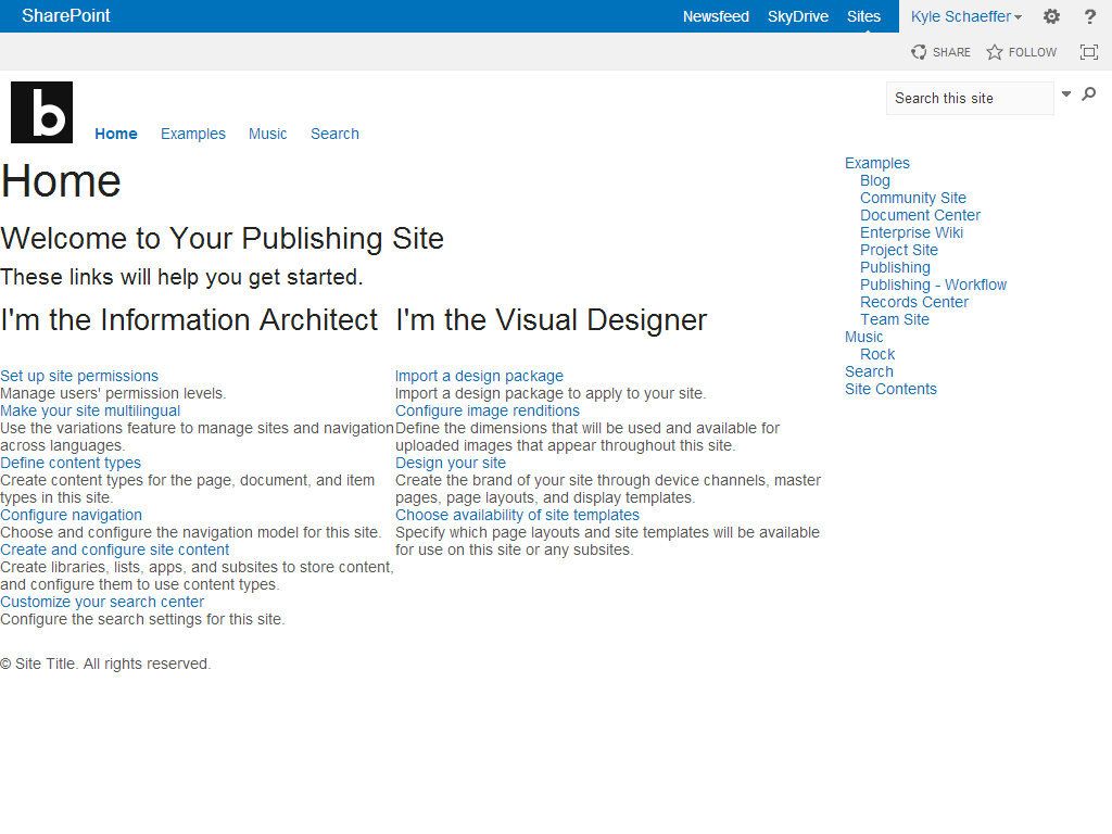
SP Blueprint is a responsive starter master page template for SharePoint 2013. Simply deploy the SP Blueprint design package and you will have a mobile-first responsive design that adapts to desktops, tablets, smart phones, televisions, and more. It isn’t a silver bullet for your mobile-friendly SharePoint site, but it can certainly help you optimize your content for today’s diverse and sometimes overwhelming plethora of screen sizes and characteristics. This is what it looks like in a few common viewport sizes:
SP Blueprint (desktop size):
SP Blueprint (smart phone portrait size):
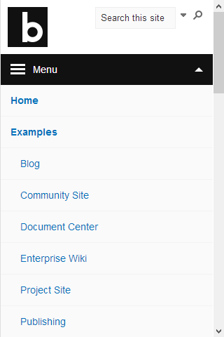
As you can see, the template is designed to adapt to the screen size automatically. Using this in conjunction with SharePoint publishing features like page layouts and web parts can really open the door for creating great SharePoint mobile experiences.
Pattern Library Widgets
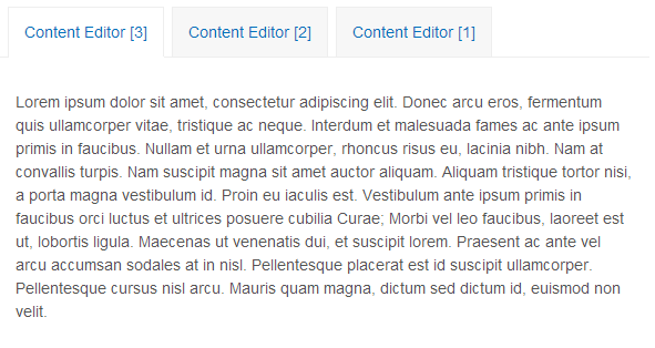
The template also includes design pattern widgets for more complex interface customization like tabs and slideshows. Simply drop a “tabify” web part into any web part zone, and it will transform that zone into tabs:
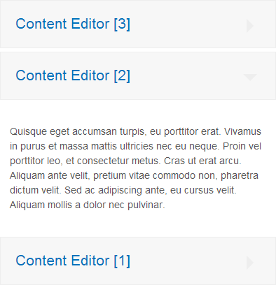
The tabs are responsive as well. If the viewport is too small for horizontal orientation, the tabs will automatically collapse into an accordion:
The template also includes a script, styles, and instructions to configure a slideshow web part using a picture library to store slide data. The basic slideshow looks like this:

The text on top of the slide image is list data stored along side the picture, so it’s easily maintained. The slideshow, too, is responsive. The images are completely flexible and will stretch or shrink to fit any width. The slideshow includes options for different transition effects (pan and fade), or customizing the timing on the transitions.
Get SP Blueprint
While the template is fairly bland, it provides a great starting point for building your responsive design in SharePoint 2013. Download the SP Blueprint design package and deploy it to your SharePoint 2013 environment in just a few minutes. To follow, contribute to, or download SP Blueprint, visit the project page on CodePlex.