
SharePoint 2010 Pop-Up Dialogs
SharePoint 2010 makes it incredibly easy to add dialog content to your website. Built-in functionality allows you to retrieve content from anywhere within your site and display it in a modal dialog that appears over the page. This is pretty standard stuff when it comes to modern web technology, but the ease of use is what makes SharePoint dialogs so amazing. In this article, we’ll explore the dialog functionality that comes with the SharePoint 2010 platform, and we’ll discover new ways to customize that content to create a uniquely fresh appearance for your SharePoint portal.
Dialogs in SharePoint 2010
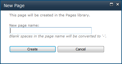
Even if you have chosen not to acknowledge dialogs in SharePoint 2010 just yet, they’re already being used throughout the SharePoint platform for things like pages, lists, and libraries. Every time you create a new page, for instance, you’ll see a dialog that appears on the page. It most likely looks something like this:
You’ll see similar dialogs when you create and edit list items, as well as within any document libraries that you have created throughout your site collection. These pop-up forms and views are an integral part of the SharePoint 2010 platform.
How it Works
SharePoint 2010 dialogs are fairly simple. They are basically a JavaScript pop-up dialog that include an iframe to request content from elsewhere on your site. This content can be anything inside SharePoint, even publishing pages or custom application pages that you’ve created yourself.
If you’ve ever created your own master page in SharePoint 2010, you may have been confused when you were prompted with two options when trying to apply your new master page to the site. SharePoint 2010 segregates your master page delegation between site master page and system master page. Basically, your site master page will be applied to pages, lists, and libraries, where the system master page is applied to everything else (settings, permissions, administration, and…dialogs). When you call a pop-up dialog in SharePoint, the content is requested and is displayed using system master page. If you want to start customizing the way your dialogs appear in SharePoint 2010, the first step is to format your custom master page to also work as a system master page.
System Master Pages
The most important thing you’ll want to do in order to optimize your master page for dialog use is to designate which elements of the page will be hidden inside a dialog view. If you open Microsoft’s v4.master file, you may notice that class="s4-notdlg" appears in numerous places throughout the file. The s4-notdlg class name should be applied to anything you want to hide in the dialog view. This means headers, footers, navigation, sidebars, etc. Basically, you’ll want to add this CSS class to everything except for the main content area of your design. When dialogs are displayed, anything with the s4-notdlg CSS class is automatically trimmed out.
Dealing with Style
Your design most likely has a fixed width, or at the very least, a minimum width at which it can display. Dialogs are very small in size, so the width and size formatting that you’ve established for your design won’t necessarily work nicely within the dialog view. Fortunately, any time your master page is used to display dialog content, the html element gets a special CSS class name called ms-dialog. You can use this to override any styles that you’ve set for your design, making it appear correctly both in normal and in dialog views. For example, you might have a div element in your design with an ID of wrapper. In an attached CSS file, you can style this element as it appears both in normal and dialog views:
#wrapper {
  width: 960px;
  margin: auto;
}

html.ms-dialog #wrapper {
  width: 100%;
}
In the above example, the wrapper element will switch to fluid width when displayed inside a SharePoint 2010 dialog. You may have to utilize this technique with things like columns, background colors, and other design elements as they appear inside the dialog.
Harness the Power
Now that your master page is optimized for dialog use, it’s time to start pulling some content from your SharePoint site. Creating a pop-up link is extremely easy. On any page or within a content editor web part, create a link to request a dialog page:
<a href="javascript:OpenPopUpPage('/path/to/content.aspx');">Show Me the Pop-Up!</a>You can use the OpenPopUpPage function to view any content in dialog mode. There is also a more flexible function called OpenWebPage that allows you to specify things like dialog width and height. Using these function in conjunction with a custom system master page, the limits to what you can display within a dialog in SharePoint are really limitless.
Progressive Enhancement
I’m all about accessibility, and I really don’t like it when someone asks me to put javascript: inside a link element. Users without JavaScript won’t be able to follow the link, and perhaps more importantly, search engines like Google or Bing won’t be able to track the content associations within your site. This can be a huge problem, and as such, I wouldn’t recommend using the above method for dialogs in your SharePoint site.
A better approach involves an exercise in progressive enhancement. Progressive enhancement demands that you create a solution that functions for users with the least functionality enabled within their web browsers. This means creating simple HTML links that point to real web page content. By creating simple links, you can guarantee that everyone (including search engines) can decipher and utilize the links in your site. For other users, such as JavaScript-enabled users, you can enhance their experience with things like pop-up dialogs to display content more quickly.
This is easy enough to do in SharePoint 2010, simply because our custom master page is formatted to display content in both normal and dialog views already. We can easily direct users to the normal view of the content, and override that functionality for script-enabled users of our site.
SharePop
In true progressive enhancement fashion, I have created a simple jQuery function that will turn any normal link in your SharePoint site into a pop-up dialog link, simply by associating a CSS class with that anchor tag. Add this functionality to your own SharePoint 2010 site:
- Ensure that the jQuery script library is attached to the master page or page layout on which you will utilize my script
- Add the following jQuery function to an attached JavaScript file:
(function($){
  $.fn.sharePop = function(){
    if(typeof OpenPopUpPage == 'function'){
      return this.each(function(i){
        if($(this).attr('href') != null){
          $(this).click(function(e){
            e.preventDefault();
            OpenPopUpPage($(this).attr('href'));
          });
        }
      });
    }
    else{
      return false;
    }
  };
})(jQuery);- Add a unique CSS class name to the links you wish to display in dialog view:
<a href="/path/to/content.aspx" class="dialog-pop">View Content</a>- Run the script (add this to an attached JavaScript file):
$(document).ready(function(){
  $('.dialog-pop').sharePop();
});
My script will override the default functionality of these links, and force them to display inside the SharePoint 2010 dialog view instead. Accessibility prevails, as users and search engines which do not utilize JavaScript are still able to view the content (albeit in the normal view of the design).
Dialog Style
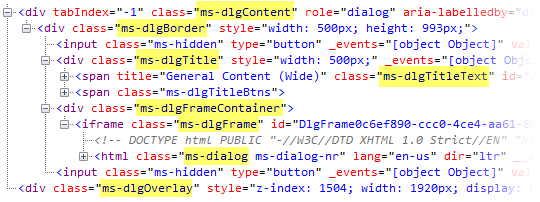
The last thing you’ll want to consider when using SharePoint dialogs is the style of the dialogs, themselves. The dialog HTML gives you numerous CSS classes that allow you to completely customize the appearance of the dialog window, and even the appearance of the shaded area behind the dialog. The following image shows the HTML of the SharePoint dialog, and I’ve also highlighted some important CSS classes you’ll use to change the appearance of the windows.
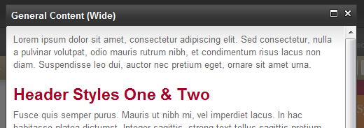
Using these classes, you can create a unique appearance of the dialogs in short order. Here is an example of a “dark” theme dialog:
.ms-dlgOverlay {
  background-color: #333;
}

.ms-dlgContent {
  border: 0;
}

.ms-dlgBorder {
  border: 1px solid #333;
}

.ms-dlgTitle {
  background-color: #333;
}

.ms-dlgTitleText {
  display: block;
  font-weight: bold;
  font-size: 13px;
  padding: 7px;
}
After adding the CSS to an attached CSS style sheet, we get a completely custom dialog appearance, along with custom content that appears within the dialog box, itself.
There’s a lot of elements coming together in SharePoint 2010 dialogs, and it can take some practice and determination to get all the pieces fitting together quite right. If you can do it once, you’ll find that these custom dialogs are a simple, fast, and amazing tool to add to any SharePoint 2010 design.