
Content Strength
You’ve seen it before. Your clients ask for it. They demand it. Perhaps you’ve done it yourself (shame on you). We’ve all done it. I’m talking about filling space with meaningless stock photography. I’m talking about photos of nameless models smiling, with their arms stretched out as if they were at the bow of the Titantic, staring at a blue sky while a photographer captures their moment of pure joy in a faux moment that is staged to look haphazard, but in reality is glaringly engineered to look just so. With the moment captured, you slap this meaningless photo on the home page of your website to elicit feelings of jubilation in your users. You may even feel a bit of jubilation yourself. But…does it work?
Stock photography is good for one thing: filling space. If that’s your only goal, it’s a tool that fits the job. In almost every case, however, I hope that filling space is not your goal. As user experience professionals, our goal is to convey information through an emotional lens. We tell stories to our users, and we do it in a way that is both meaningful and emotionally appropriate for our audience. To this end, stock photography is counter-productive and counter-intuitive. It’s not meaningful. It’s not emotionally appropriate. And, users can smell a stock photo from a mile away.
Don’t get me wrong. I’m not advocating against photography, not at all. Imagery is an important part of many a good design. It has it’s place. What I’m really talking about is the strength of your content. My problem with stock photography is that it’s weak. It doesn’t add to the emotional value of your content. It doesn’t add strength to your design.
A simple example
Now I’m going to poke some fun. Let’s take, for example, one of the many thousands of website designs that include a huge hulking stock photo on it’s home page. While I have many to choose from, in this case we’re going to pick on Wells Fargo (sorry, Mr. Fargo). This is the welcoming photography we see at WellsFargo.com:
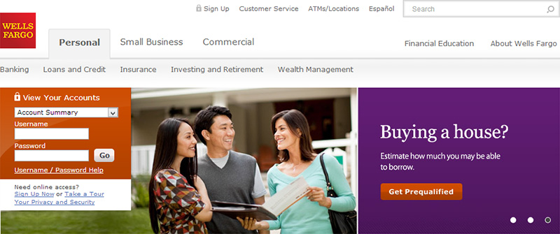
Is it just me? When I look at this, it’s entirely too obvious that the people in this photo are models trained in the art of the smile. Immediately, I get a sense of disconnection. The imagery is weak, and it doesn’t support the emotional context of the “Buying a House?” headline. Strong content reinforces emotional themes. As designers and information architects, we should always be asking ourselves, “What are our strengths?” Wells Fargo is a financial institution that allows their customers to buy in to the American Dream. They can finance your dream home, and help you put down the roots of your life. That’s an amazing thing, and the imagery or photography used should reinforce that feeling. Using something as simple as real photography of houses financed by Wells Fargo would go a long way to creating strong content. Real content.
Let’s compare this example to a similar design that uses strong content. This is the home page of GetHarvest.com:
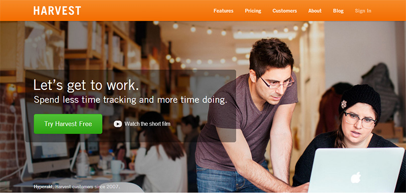
In comparison with the Wells Fargo example, there are many similarities. Prominent branding, prominent use of navigation, and the design is dominated by similar components: a headline, photography, and accompanying call to action. If you’re like me, there’s something slightly intangible that makes this design so much better. While we could talk all day about use of color, space, typography, and the like, for me it really comes down to Harvest’s use of strong content. Notice that at the bottom of the photo, they include a caption that indicates the photo is from a company called Hyperakt, who has been a loyal customer of Harvest since 2007. This imagery strengthens the design because it’s real. It depicts real customers and reinforces the emotional theme of productivity.
When photography doesn’t work
Strong photography simply isn’t an option for some websites. Maybe you have a small organization that doesn’t have the resources to hire a professional photographer, or you don’t really have anything strong to photograph in the first place. I’ve seen this most commonly in engineering organizations where the primary product is code. Code isn’t very exciting, and certainly doesn’t make for a great photo op. It’s times like these when stock photography can look particularly tempting.
If you find yourself in this situation, stop and think. If you can’t produce strong photography, why use photography at all?
There are ways to create strong content without the need for photography. Data can be strong. Typography can be strong. Geography can be strong. The hard part is figuring out what your strengths are. The power of the web today allows us to present simple information in an infinite number of creatively interactive ways. This is why cookie-cutter design work simply doesn’t work. All content is different, and all content should have at least one strength. You have to identify that strength, use it, and make it prominent in your design.
Consider this example: DangersOfFracking.com:
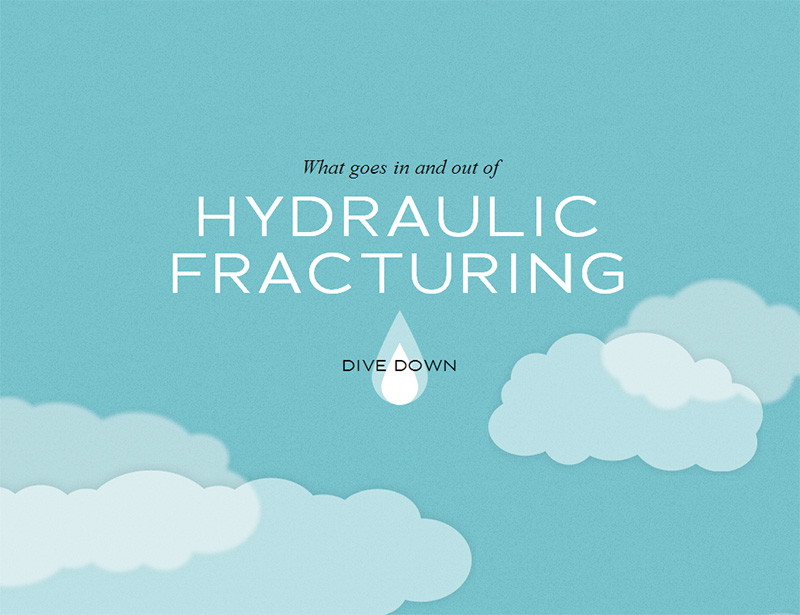
Controversial issues aside, I’m going to consider this website only for it’s intuitive use of content strength. The designer in this case employed a creative use of strong content, sans photography. It’s a highly visceral experience, following the path of a drop of water using simple shapes, drawings, textures, and typography. Each screen contains only a few lines of type, and reinforces an emotional theme throughout. This is but one of many great examples of strong content without a need for photography.
Some websites employ a heavy use of type: strong headlines that are designed to capture and keep your attention. Others use sketches, drawings, and other forms of art to reinforce communication with users. Still others use infographics, maps, and creative visualizations to present pure data, which would otherwise appear as weak content in raw form, in an interesting and intuitive way that makes this content strong. The possibilities are limitless. We can take the simplest of elements, the smallest amount of content, and with our tools of design and development, make that content bold, or interesting, or fun. We should treat photography for what it is: a tool in design, but not a requirement. Shun the temptation to slap that stock photo on the home page of your next project.
My humble plea
I have a burning hatred for stock photography. I always have. This is my humble plea for you, Mr. Reader, to change your ways and to push back when clients ask for weak content. Let’s stop wasting space in the canvas of the web browser, and fill our screens with useful information that is appropriate for the audiences we seek to connect with. Let’s hire photographers to capture real products, real clients, and real content that supports our emotional goals. Let’s spurn the norm, and urge our clients to use real content. Strong content.