
All About Table-less Column Design
There are a number of ways to create vertical columns in your XHTML design without using the <table/> tag and the horrendous amount of HTML that always seems to accompany it. Each method listed here is superior in various situations, so choose a good fit for your particular design.
But…why?
Why do we go through all the trouble of creating table-less designs? In short, the answer is performance. At times, it may feel easier to simply drop in a table tag and quickly split your design into columns, but that’s not always the best option. Tables create a large amount of extraneous HTML that can make your pages slower for visitors to download. While it may not seem like a huge difference at first, when designing a template for a very large site, the difference can be astounding.
CSS that is defined in externally linked files is cached on client computers, meaning that anything you put in your external CSS files is downloaded only once. Once that CSS file is downloaded, it is quickly loaded on subsequent page visits, which is faster for your visitor and easier on your web server.
Why is this important? Stay with me, we’re getting there!
Generally, the content in your site changes as visitors browse from page to page, but the overall design remains the same. It is much easier (and faster) to store this persistent design information in cached files, such as images and CSS.
In a table-less column design, almost all design information is stored in cached CSS files. A design that uses tables, on the other hand, often includes some of this information directly in the HTML, forcing users to download the HTML on every page in the site. Whenever possible, site design should be done in CSS rather than in HTML; for this reason, table-less designs are the modern preferred standard in web design.
Floating Columns
The float attribute in CSS is very powerful. So powerful, in fact, that many people seem to shy away from using it. Don’t be afraid! A bad float can ruin any good design, but using them when appropriate will alleviate your HTML-table woes.
The HTML:
<div class="columns">
  <div class="left">
    <p><strong>This is left-hand content.</strong></p>
    <p>Lorem ipsum dolor sit amet.</p>
  </div>
  <div class="right">
    <p><strong>This is right-hand content.</strong></p>
    <p>Lorem ipsum dolor sit amet.</p>
  </div>
  <div class="bottom"></div>
</div>
The CSS:
.left {
width: 60%;
float: left;
padding: 0 2% 0 0;
}
.right {
width: 35%;
float: left;
padding: 0 0 0 2%;
}
.bottom {
clear: both;
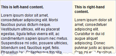
}The Result:
Advantages:
Fluid width — allows for dynamic width (resizing)
Fluid height — matches the height of the tallest column, allowing for fully dynamic height of all columns
Disadvantages:
Floating — if you are using fixed-width columns, and if the content in a column is too wide, your columns will word-wrap within your design and stack on top of each other
Variable column height — background colors or images applied to columns will not match in height
Absolute Columns
In many cases, the floating column design does the trick quite amiably. If, however, for some reason you find yourself in a situation where you are using a fixed-width design, and you really can’t control the width of content in your site, floating columns can become a nightmare. There’s nothing worse than seeing your left-hand column disappear from your layout, only to be re-positioned at the bottom of your page! If that’s the case, you may consider using the absolutely-positioned column design.
The HTML:
<div class="columns">
  <div class="left">
    <p><strong>This is left-hand content.</strong></p>
    <p>Lorem ipsum dolor sit amet.</p>
  </div>
  <div class="right">
    <p><strong>This is right-hand content.</strong></p>
    <p>Lorem ipsum dolor sit amet.</p>
  </div>
</div>
The CSS:
.columns {
position: relative;
}
.left {
width: 60%;
margin: 0 35% 0 0;
padding: 0 2% 0 0;
}
.right {
position: absolute;
top: 0;
right: 0;
width: 35%;
padding: 0 0 0 2%;
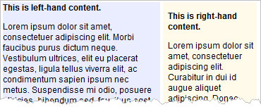
}The Result:
Advantages:
Fluid width — allows for dynamic width (resizing)
No floating — consistent even when content is too wide to display
Disadvantages:
Minimum height — the absolutely-positioned column must always be shorter in height than the fluid column(s), else it will display on top of design elements below
Variable column height — background colors or images applied to columns will not match in height
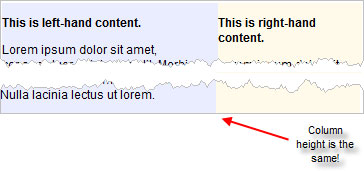
Concerning “variable column height.”
I would like to point out that “variable column height” is listed as a disadvantage of each method. The main disadvantage in using table-less CSS column designs is that when you have two elements side-by-side, they won’t necessarily match in height. If your design requires two shaded columns to match in height, this table-less approach may not be your best option. In general, it’s best to create designs that don’t require this type of approach from the get-go. Many people try to compensate for this lack of height-matching by using repeating background images that make it appear as if the columns match in height, but I have never been a fan of adding images to do something that HTML and CSS could handle otherwise.
When all else fails…
The only time I use a table in HTML is to (1) display tabular data or (2) when I absolutely need to have two height-matching elements display side-by-side in a design. Some fanatical CSS enthusiasts would argue that this is a lame approach, but in some cases designers need to act on simple pragmatism.
If you’re in a situation where you need to use a table, please do not use extraneous HTML. The cellpadding and cellspacing attributes are not needed! You can do everything with CSS. It goes something like this:
The HTML:
<table class="columns">
  <tr>
    <td class="left">
      <p><strong>This is left-hand content.</strong></p>
      <p>Lorem ipsum dolor sit amet.</p>
    </td>
    <td class="right">
      <p><strong>This is right-hand content.</strong></p>
      <p>Lorem ipsum dolor sit amet.</p>
    </td>
  </tr>
</table>
The CSS:
.columns {
  width: 100%;
  border-collapse: collapse;
}

.left {
  width: 60%;
  padding: 0;
  vertical-align: top;
}

.right {
  width: 40%;
  padding: 0;
  vertical-align: top;
}
The Result:
It may still be a table, but it’s a minimal table if I ever saw one.
Good luck, and happy styling.