
10 Things a Website Should Never, Ever Do
As a designer of the world wide web, you are armed with the power to amaze, enlighten, entice, and captivate. The web is an easel for your creative aspirations, and the content you design for is the foundation of your creativity. With so much power at the tips of your fingers, you also possess the ability to deter, annoy, anger, and infuriate. Your users are yours to command, their emotions yours to pluck like the strings of a harp.
It’s the latter of these powers that we discuss today: your ability to destroy the desire for users to stay on your site. We’ll examine the causes of user strife on the web, and see clear examples of common mistakes that designers and developers all-too-often seem to make.
1. Never interfere with the ability to scroll
The browser window is a fairly simple application: an address/search bar, a few buttons, and a big window where users read, scroll, and click. Sure, most browsers have other bells and whistles, but it really boils down to these essential elements of the browsing experience. Rule number one: never, ever (ever, ever) interfere with these most basic features of the browser window.
Example: Microsoft SharePoint 2010
 One of the most preposterous features of an interface that I’ve seen is SharePoint 2010’s new ribbon interface. The default SharePoint 2010 interface includes a simple CSS style that disables the scrollbar on the
 <body> element. Microsoft chooses to remedy this by adding a scrollbar to other division elements in the interface instead. This results in a fairly impressive “fixed” ribbon, but it has some infuriating side-effects.
- When a SharePoint 2010 page loads, users will not be able to scroll until all JavaScript has loaded. On slow servers or on large pages, this can take up to 2-3 seconds, which can be quite infuriating.
- Some devices don’t execute the JavaScript in the expected fashion, resulting in the complete inability to scroll on mobile devices and tablets.
An easy solution
The truth is, creating a “fixed” element is a fairly simple CSS technique that has become extremely popular in the last few months. The complexity of Microsoft’s interface is it’s downfall. Always practice in simplicity, because fewer things can go wrong in the end. Build simple interfaces, and never disable the scroll bar. Do this, and you’ll know at least one person who doesn’t hate your guts.
2. Never allow form resubmissions
Forms are a fairly standard feature of the web. Users see them and use them all the time: to sign up, sign in, order, update, and the like. With so much familiarity, it’s a wonder that forms are one of the largest sources of frustration to users. Between data, validation, formatting, handling errors, and all the auxiliary things that seem to surround web forms, things can get pretty complex for designers and developers. All the while, you try to keep it simple for your users. It’s a tall order, to be sure, but there is at least one thing that you can do to help users stay calm.
Example: The Form Resubmission Prompt
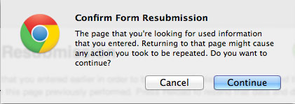
This is Google Chrome’s form resubmission prompt. Most browsers have something very similar. This appears when users click on the “Back” and “Forward” buttons in the browser, or when they “Refresh” a page on which they have submitted a form. As web junkies, we might know what this means, but it has a more elusive meaning to your every-day internet users. Most of the time, you’ll find that users simply click the default option (in this case, “Continue”), which can lead to duplication of orders, data, requests, and all sorts of things that would be better off if avoided. Also, it’s just another annoying prompt that users encounter while they’re using your site.
A Simple Solution
The solution to form resubmissions really depends on the platform your website runs on. In most cases, a simple fix is to separate the script that submits the form data, and the script that receives and processes that data. For example, if you’re using a PHP-based platform, you might have a form that looks like this:
<form action="submit.php">
  <input type="text" name="user" required />
  <input type="password" name="pass" required />
  <input type="submit" value="Log in" />
</form>
To avoid the resubmission prompt, your submit.php script would forward to another page, rather than displaying a page in the browser.
if(isset($_POST['user']) && isset($_POST['pass'])){
  // do something with the form data
  header('Location:/login/form.php?success=true');
}
This receiving script never actually displays anything in the browser window. Instead, it receives the form data, does something with it, and then forwards the user somewhere else. Using this technique, when users click on the “Back” or “Forward” button, the browser will skip the submit.php page completely, and never see the annoying form resubmission prompt.
3. Never disable keyboard support
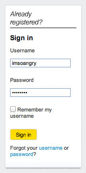 While we’re on the topic of forms, let’s look at another deviation from web standards you’ll want to avoid. Here, you’ll see a screenshot of the login form at mysprint.sprint.com. I have a Sprint mobile phone, and I occasionally use this login form to sign in and review my account, see my bill, or (more commonly) daydream about all the fancy new mobile phones that I don’t have.
What went wrong
The font sizes are a little small for my taste, but the appearance of this form is not the worst I’ve seen (yes, that was a compliment). Design and aesthetics aside, there’s one feature of this form that drives me absolutely crazy. It’s an extremely simple form, one that I’ve encountered on countless other websites before. As usual, I would expect to enter my username and password to sign in without a fuss.
Unfortunately, this is not the case. While focusing in either the username or password textbox, pressing the ENTER key does absolutely nothing. I’m not the type of user that wastes time after filling out a form by lifting my hand from the keyboard and finding the submit button with my mouse cursor. I’m all about speed: on most websites, it’s type, type, ENTER, and the form has been submitted. On Sprint’s website, however, they’ve removed this behavior, and thus they’ve earned a place on my list of don’t-do’s.
4. Never fail to give feedback
Feedback is important, especially if you’re working with the awesomeness of AJAX. Traditionally, you knew what was going on in a web page, because any time you clicked on something, you had to wait while the next page loaded. There was a very apparent interaction period, and very obvious feedback from that interaction. With the introduction of new technology like AJAX, however, that feedback is not always so obvious. Today’s websites are much more interactive, and the result of those interactions (whether successful or not) needs to be communicated to the user.
Example: Facebook
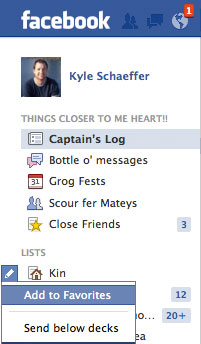 There’s an easy way to test this: visit a web page, turn off your wireless adapter, and then click on things and see what happens. Obviously, because you’re not online, anything you do should be very obviously followed by a “no connection” message or some sort of indication that you’ve failed to do something. Facebook, a website that makes gratuitous use of AJAX for interaction, is not so good about warning users when things have failed.
Editor’s note: yes, I am using pirate Facebook.
One particular example is the new “lists” feature that allows you to mark a list as “favorite.” Even when you’re offline, Facebook gives you no indication that the action has failed. Never assume that users will have a fast connection, or that AJAX requests will complete. You should always provide feedback if something fails, especially when no page loads are involved.
5. Never disable keyboard navigation
Different strokes for different folks. That’s a saying that I like to spew off at random times, usually in a failed attempt at humor, but the lesson of this silly quip is tried and true: everyone has their own way of doing things. This can also be applied to navigation on the internet. Some people prefer to use their cursor for absolutely everything, and only resort to keyboard use when absolutely necessary. Others use the keyboard almost entirely, tabbing, backspacing, and scrolling their way through the world of the world wide web. Others, still, use gestures and touch screens to flick and fly their way through the internet. As a crafter of the interactive, you must adhere to all of these people. Never detract from your users’ ability to navigate in whatever way they damn well please.
Example: No, I don’t want to search
 I’m going to use eBay as an example, just because they’re so big, but many websites out there are guilty of this annoyance. Upon arriving at eBay’s website, they use JavaScript to auto-focus on the search bar. I guess they’ve already decided, before you even visit, that you want to search their website. For some users, however, this can be incredibly annoying. A common and simple way to scroll down the page, in all browsers, is to press the space key. Pressing this key will advance the screen about one page, so you can continue reading without having to worry about scroll bars and the like. If you’re auto-focused on a search box, however, it disables your ability to do this. Even if it’s only a minor annoyance, it can be incredibly frustrating to users who like to navigate in this fashion. Likewise, I often use the backspace key instead of the back button to go back when I didn’t find what I was looking for. With the focus on a search field, backspace navigation simply doesn’t work.
The fix for this one is easy: don’t do it. It’s annoying.
6. Never move content without user interaction
Websites can be so damn sneaky. I guess they need to make a buck, but who doesn’t? One thing that will drive your users bonkers is anything that moves without a prompt from the user. Yes, I’m talking about you, “auto-expanding-advertisement-that-plays-a-stupid-video-of-a-guy-who-walks-across-my-screen-when-I-just-want-to-read-the-damn-article” guy. I also dislike anything that happens on hover (including drop-down menus). Hover is so 2000’s, get with the times, people. The only time your website should “move” or “do something” is when users tell it to. Most simply, any time they click, drag, or scroll. That sounds simple and obvious, but not everyone adheres to this most basic of principles.
Example: Digg.com
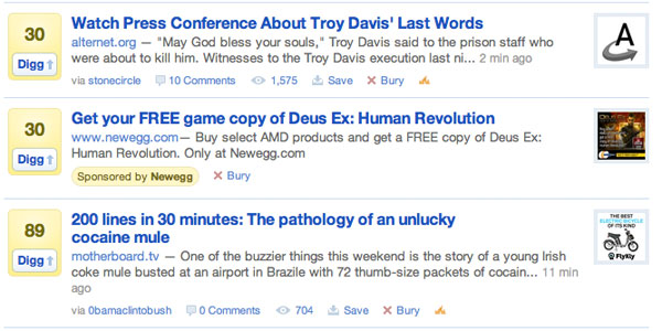
While the quality of Digg’s content is another concern, one thing that does drive me crazy is the sponsored links that appear in the rollup. Notice the promotion from NewEgg.com. This link does not actually appear on page load, but rather when users hover their mouse cursor into the rollup of popular stories. This means that if you’re a fast clicker (aren’t we all?), you will often accidentally click on the advertisement instead of the story you’re interested in. Good for Digg, bad for users. Stop being so shifty, internet.
7. Never use fixed position without a fallback
A “fixed” element in the browser window is one that stays on the screen, even as you scroll down the page. It’s a simple CSS technique, but it’s been amazingly popular in recent months. One thing I’ve noticed in all these fixed designs is the failure to provide a fallback for users who are on smaller screens. The truth of the matter is that the web isn’t just for desktops any more. Internet connectivity is coming in all sorts of shapes and sizes: desktops, laptops, mobiles, tablets, e-readers, gaming consoles, and even refrigerators (yes, even refrigerators). The future promises only more diversity in internet-connected devices, and that means you can’t assume users will have a large viewing area on which to see your website.
Example: Pandora.com
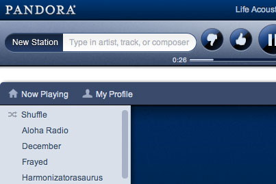
This is a screenshot of Pandora’s fancy new HTML5/CSS3 design. First of all, I’ll say that I love Pandora. Maybe too much. It’s pretty awesome, and it even lets me give all of my radio stations quirky little names like “Harmonizatorasaurous” (eat that, spell-check).
Pandora’s new design includes a fixed header, like many new designs, but it seems the header does not provide a fallback for users on a smaller screen. When reducing the window width, it clips the player controls off the edge of the screen. If a fixed element is clipped, users can’t see it, even if they try to scroll to see more, which can be a huge problem.
A simple solution
An easy solution to this problem is to make the default behavior of your site’s header to maintain a static position, but when users have a large enough screen, you can make things fixed for a more impressive presentation. The following jQuery snippet does the trick quite nicely:
$(window).resize(function(){
  resizeUI();
});
$(document).ready(function(){
  resizeUI();
});

// resize on page load AND window resize
function resizeUI(){
  if($(window).width() > 500){
    $('#header').css('position', 'fixed');
  }
  else{
    $('#header').css('position', 'static');
  }
}
This script runs both on page load AND as users resize the window, so no matter what happens, you can decide whether or not to use fixed elements. You’ll have to mess with the values that the script looks at (width and height) to determine what works best for your site’s design, but it’s a useful technique to use.
8. Never use pop-up windows
Do I really even have to mention this one? I thought that pop-ups were notorious for the infuriating behavior that have on users, but I still see them “pop up” from time to time (pun intended).
Example: TinyMCE
 I never use pop-ups. I always recommend against them. A common excuse is that your site should stay open, in it’s own tab, even if users click a link that takes them away from your site. I’ve got a simple response to that: wrong! Don’t let your head grow so big that you think your website is god’s gift to the internet. Users have gotten pretty comfortable with the idea of tabbed browsing, and they know how to manage their windows. Unless you’re Google, you’re not allowed to use pop-ups. It’s that simple.
Imagine my surprise when I attempted to implement the TinyMCE JavaScript editor into a web application I was building, and realized it still used pop-up windows for things like links and images. I am building a PHP application, and I have had stars in my eyes for WordPress the entire time, so TinyMCE was the obvious choice. I was so taken aback by this behavior that I ended up switching to CKEditor, another popular editor that has recognized the need to rid the world of these annoying little boxes, and I’m all the happier for it.
9. Never get quirky (well, not too quirky)
I love websites that are different, but not too different. There’s a fine balance to be made between adhering to expectations, and getting so weird that users have no idea what’s going on. As with most users, if I visit a website and am prompted to “explore this insanely huge image of nonsense to learn how to navigate our site,” I’m going to leave and never return. I’ve never been a proponent of Flash, for this very reason, but I also recognize that it has it’s place. Flash can enhance a website’s content with some awesome features, but it should never be used to present content in its entirety.
Example: Sony.com
 Check out Sony.com, and you’ll realize that a full 5-8 seconds will go by before you actually see anything on the screen that you can click on. Almost the entire site is in Flash, and it breaks about five of the ten “don’t do’s” that I’ve described in this article. All that aside, Sony has provided a non-Flash version of their site, which also subsequently presents a loading spinner for about 2-3 seconds that covers all of the content on the page. I’m not entirely sure why the designer who created the Sony website was so fond of things that come between users and consuming the content they came to read, but I do know this: it’s annoying. Don’t do it.
10. Never do THIS…
Okay, this last one is really just for fun, but never do THIS…
body * {
  -webkit-transition: all 0.5s ease;
  -moz-transition: all 0.5s ease;
  -o-transition: all 0.5s ease;
  transition: all 0.5s ease;
}

body *:hover {
  -webkit-transform: rotate(180deg);
  -moz-transform: rotate(180deg);
  -o-transform: rotate(180deg);
  transform: rotate(180deg);
}
Try it out by clicking on this button (you’ve been warned):